Morgan Keys


OpenGov: Chart of Accounts Manager
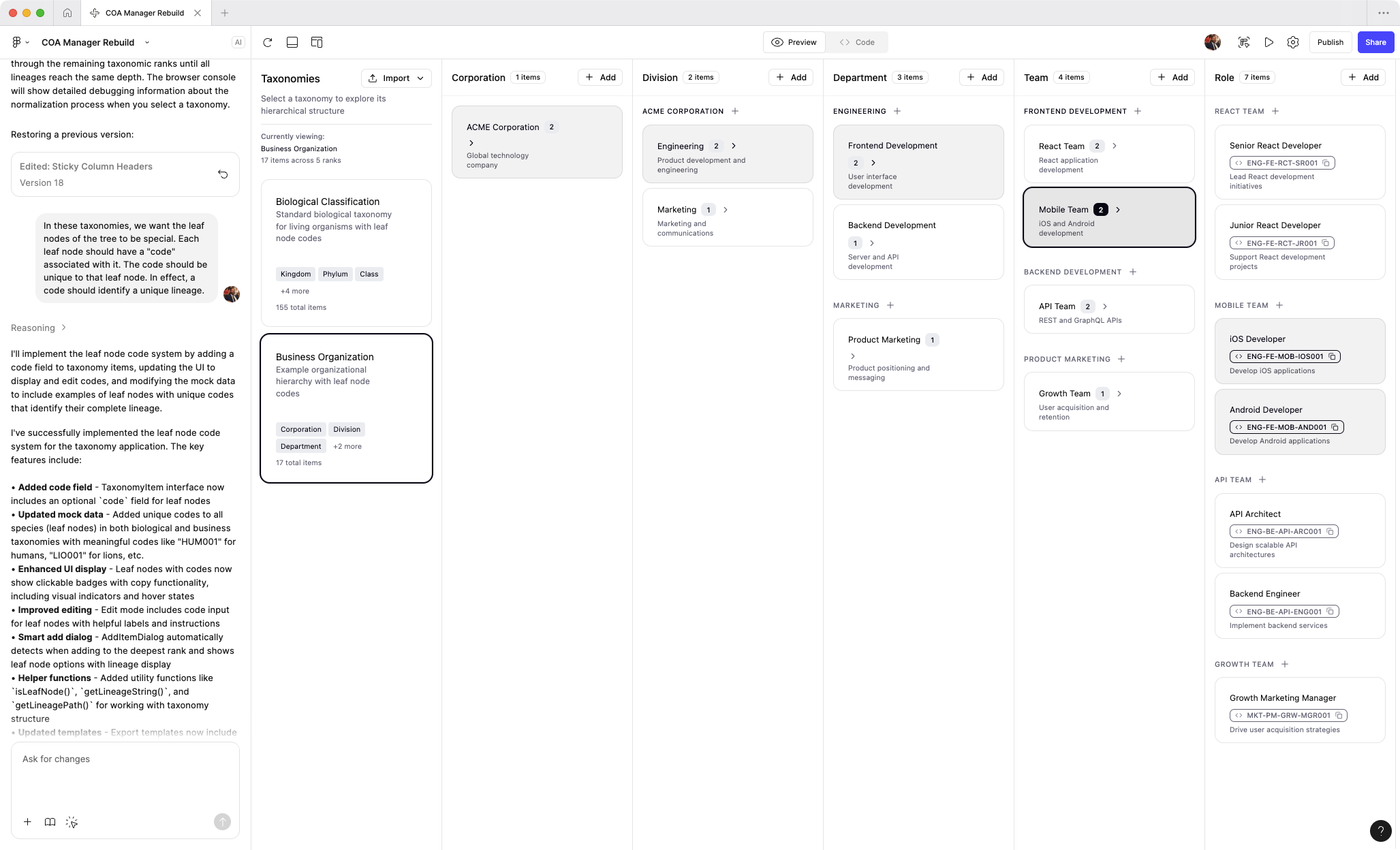
Live prototype available!
I’ve recently been exploring AI prototyping tools. As a fun exercise, I’ve rebuilt the COA manager experience from memory. I’m continuing to tweak the prototype and add features from the original product. It’s currently un-styled, but you can get a sense of the interaction paradigm and what makes this product unique. (Built with Figma Make)
View AI prototype
Public servants
OpenGov’s primary users are the public servants who run local governments. This can include elected officials such as mayors, but the more common, day-to-day users are department heads, analysts, accountants, and finance directors.
The bulk of my work focused on accounting and finance users. These users are risk-averse, detail oriented people. But they also take pride in their work and view it as their solemn mission to articulate financial data in a way that their staff and the public can understand.

Financial transparency
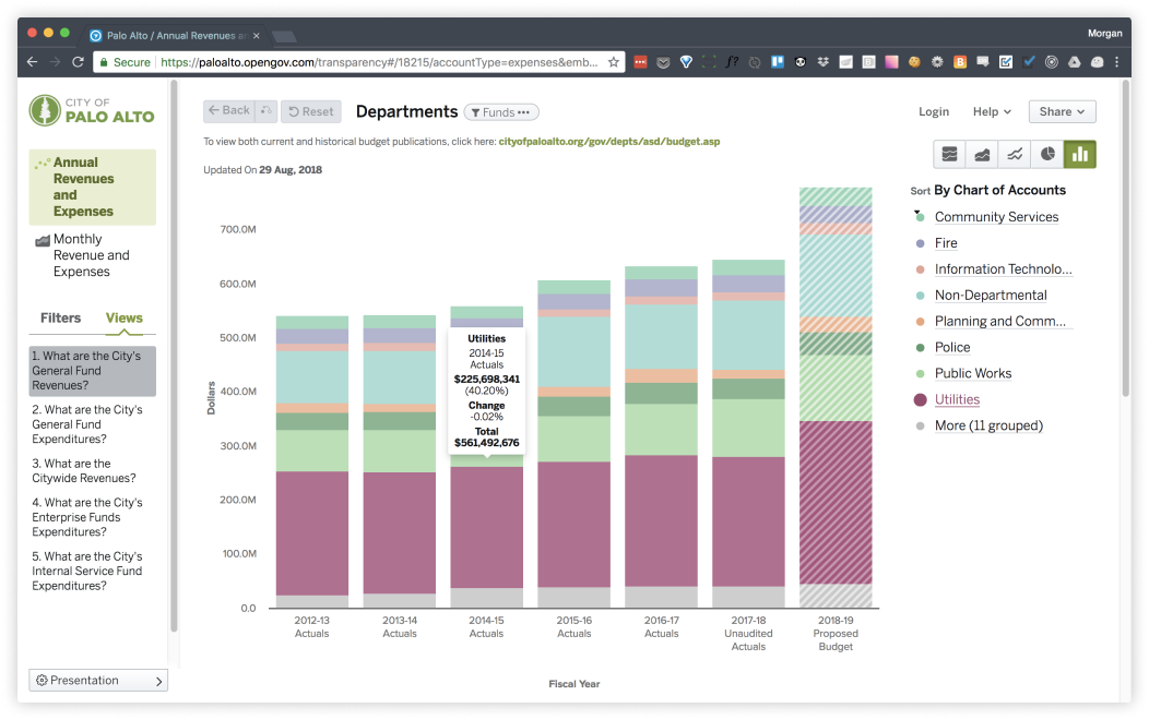
Local governments upload large amounts of data to OpenGov on a quarterly or monthly basis and then use the platform to share interactive reports both internally and publically, with the citizens they serve.
Due to the complexity of financial data, the usefulness and accuracy of these reports is heavily dependent on the way data is categorized. Sophisticated categorization schemes are created in enterprise resource planning systems and must be mirrored in OpenGov.
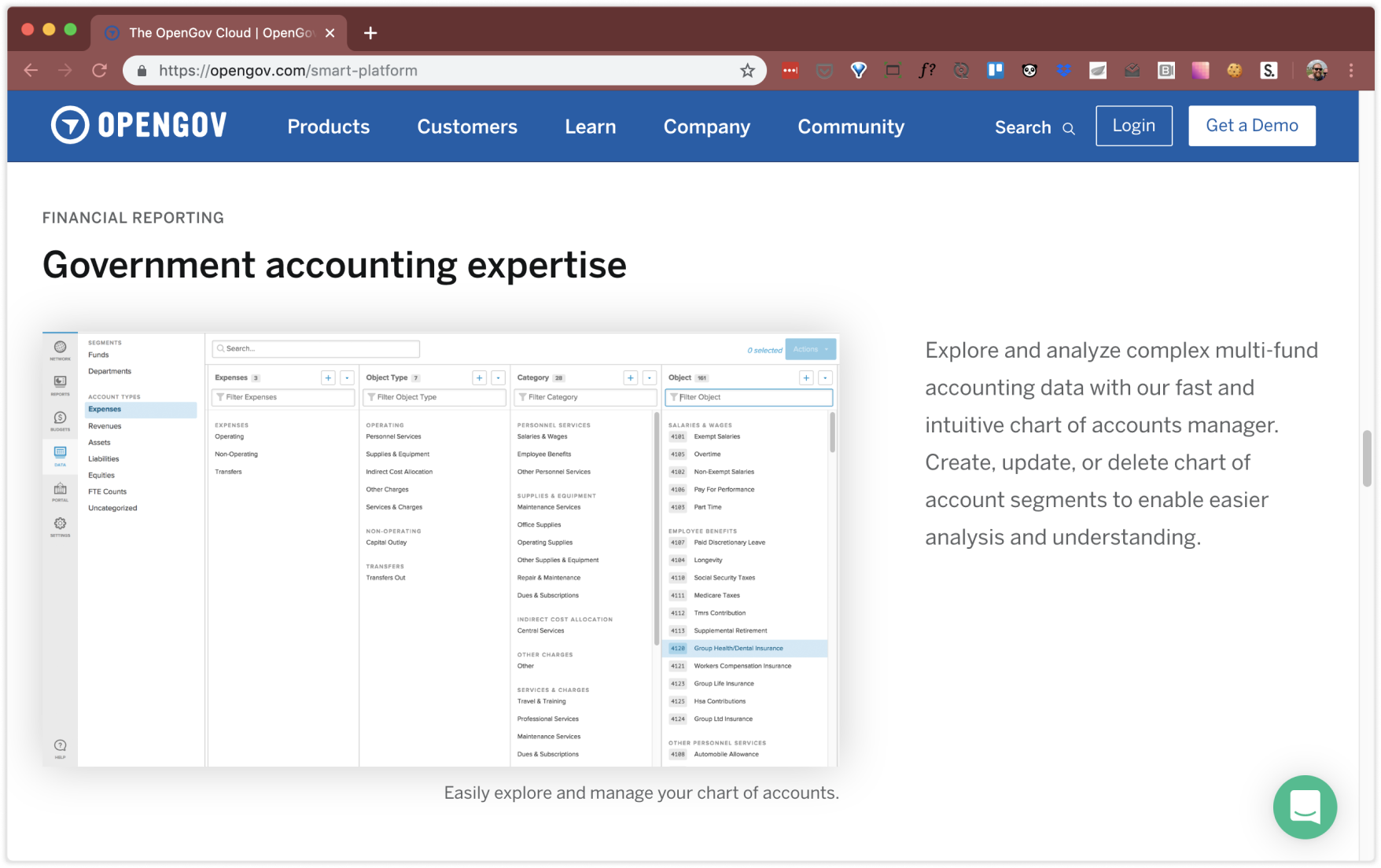
The categorization scheme for an organization is referred to as a “chart of accounts”.
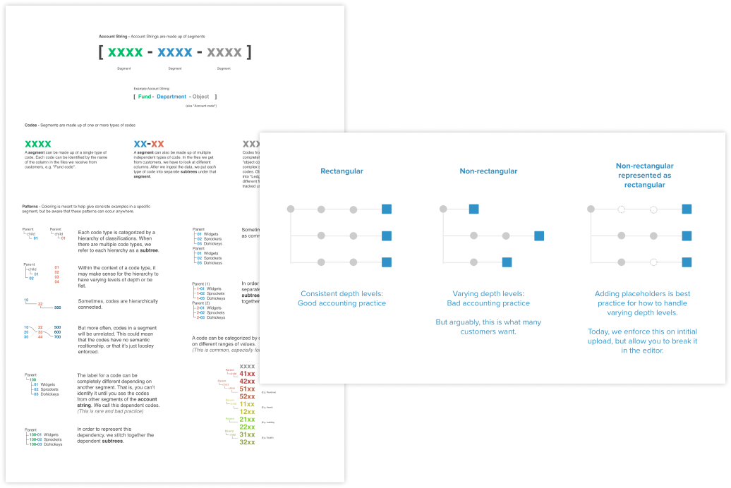
Taxonomies
A chart of accounts is a long-standing, esoteric accounting tool, but it is essentially a series of taxonomies. Thus, an easy analogy for the average person would be the classification of animals: just as scientists place an animal into groups, one for each level, accountants do the same for transactions.
The difference in accounting, though, is that they use multiple taxonomies for each transaction and the structure can vary from one organization to another, or even based on the kind of report.
A small government might use three taxonomies, each with 2-3 levels. But more sophisticated govenernments could have 4-5 taxonomies, with up to six-levels. We often saw charts that tracked tens of thousands of types.

The legacy solution
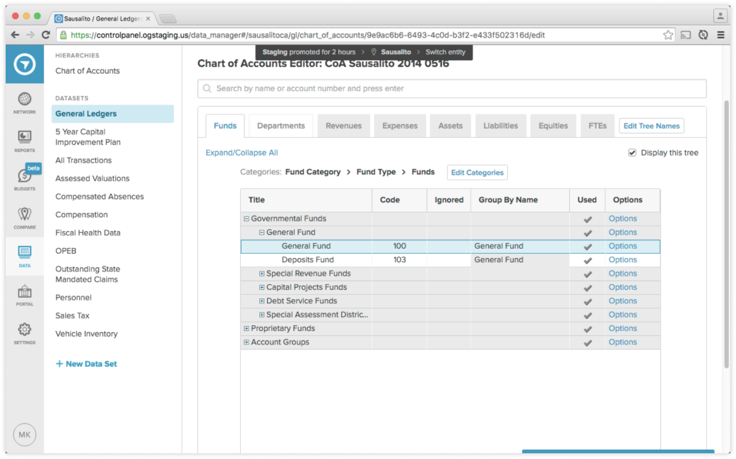
OpenGov already had an existing tool for managing charts of accounts, built as an MVP in the early days of the start up.
The tool made certain implementation assumptions that meant these taxonmies had to be handled separately. It also used a folder-like interface that did not actually represent the data well and, due to a lack of error-handling, even allowed users to make non-sensical edits and corrupt their data accidentally.
When I was assigned to work on a chart of accounts manager redesign, there were things we couldn’t change, but we could improve the user interface.
Listening and learning
Other than a background in math and a curiosity for data structures, I had little relevant experience to draw on for this project. My first step was to listen and learn.
Luckily, we had retired finance directors on staff with decades of experience. We also had a team of technical support staff who were talking with customers on a daily basis, training them and solving technical challenges. I set up learnings sessions and made countless desk-visits.
I also took the opportunity to join customer calls and learn from customers directly. I listened for the kinds of questions they asked customer success and then asked questions of my own.

Becoming an expert
Given the complexity of this tool and the data it was managing, I had to really grapple with the subject matter. I began diagraming concepts, at first just to help articulate ideas to myself.
I shared these diagrams with the customers success teams for feedback. It prompted great discussions, but we also realized that these documents could be training tools. After all, I was not the only team member struggling to learn these concepts.
The customer success team ultimately began distributing these documents to customers as well. Over the course of this project, and in my later work, I became one of the company’s chart of accounts experts.
Early concepts
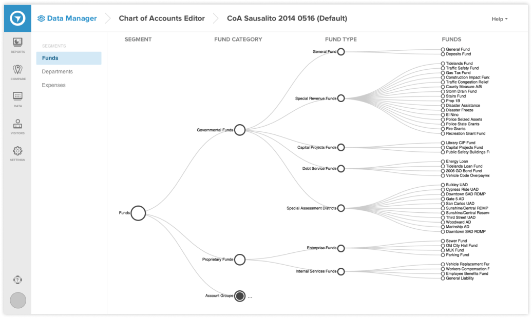
When I felt that I was beginning to grasp the concept of a chart of accounts, I looked for ways to better represent it in the interface. Inspired by a popular data-visualization library, I tried mocking up an interface that represented taxonomies as a dendrogram.
It was an exciting approach, with the potential to give an unprecedented bird’s eye view of the chart of accounts. But there were serious problems.
First, the tree like organization made it difficult to view the entire categorization for a type—something critically important in a taxonomy. Second, illustrating the connections meant that text was not packed tightly and it would be hard to see thousands of nodes in a readable way.
Back to the drawing board
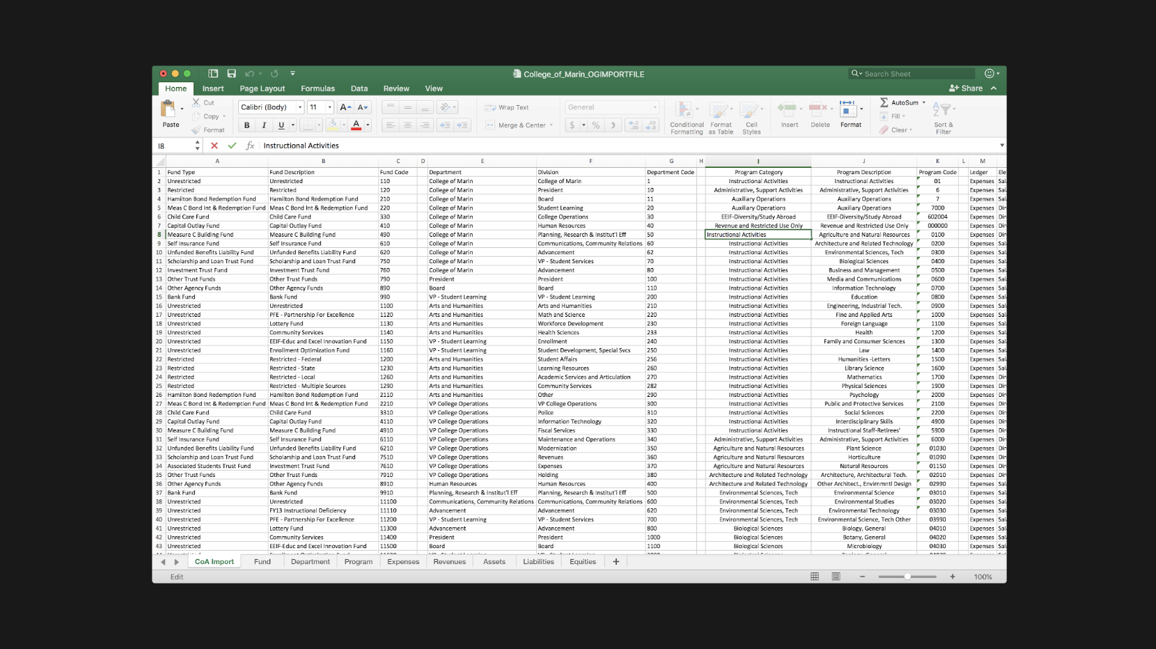
One of my favorite, under-appreciated research methods is artifact analysis. By analyzing the files and objects that people use to perform their work, you can learn valuable, tacit insights.
I examined the spreadsheet files that users were uploading to OpenGov. I tried to understand the way information was laid out. I realized that spreadsheets did a great job of displaying taxonomies in a compact, readable, and easy to manipulate way. There was only one draw-back to the spreadsheet—the row-column grid required that labels be repeated to show when many categories were grouped under a parent, leading to visual noise.
It occured to me, what if we could make something dynamic?
A new concept
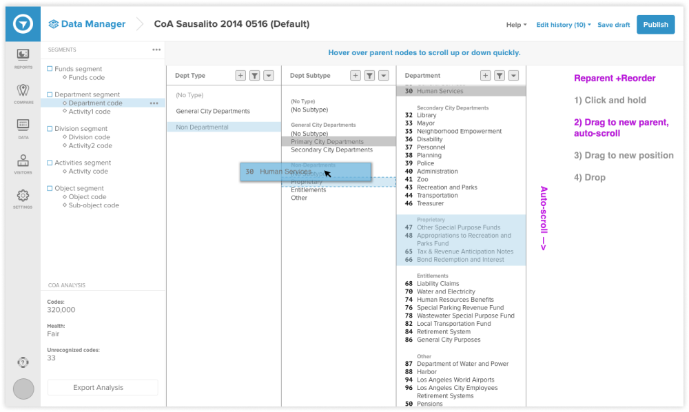
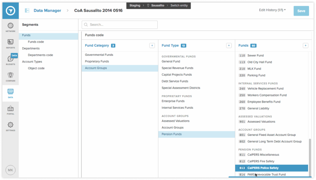
Imagining a dynamic spreadsheet, with columns automatically scrolling to show relationships, I mocked up the new concept. It was a difficult concept to communicate abstractly so I tried various methods to explain them. I tried Framer, animations, and even simple html/css prototypes. The concept became known as the “slot-machine” in reference to the way it synchronized.
Eventually, I paired with an engineer who built an early alpha version for testing.
Usability testing
I travelled with OpenGov account mangers to visit local customers and test with live customers. I used a short pre-interview script and ran a standard task-based usability test. The goal was to assess if users could understand what the interface was communicating and if they could sucessfully perform basic editing and navigation tasks.
The results were very positive. Especially considering the unique approach to visualization, it was exciting to see how naturally users picked it up.
These tests provided important validation of the concept, but we later learned that there were limitations.
Working with Customer Success
OpenGov is an enterprise sales company, which means that account management and customer success play a huge and ongoing role in the customer experience. In fact many customers, due to busy schedules or a lack of tech savvy, relied entirely on customer success to handle the technical work necessary to set up their accounts. This included working with the Chart of Accounts Manager.
And though I had spent many hours speaking with and learning from Customer Success, it became clear that they were the true power-users and I would need to learn their day-to-day workflows as well.
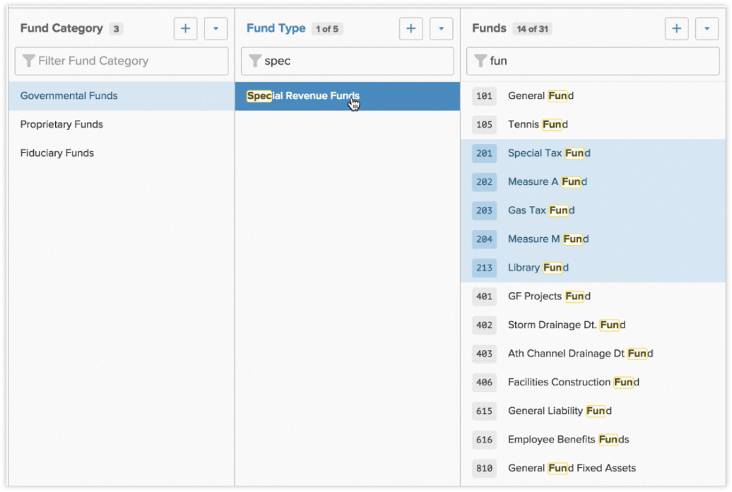
Based on learnings from 1-on-1 work sessions, I designed several features that enhanced their ability to search and make bulk-edits. One such feature allowed users to apply multiple filters at different levels, meaning they could quickly target a set of items and then easily move them to a new parent.
These features opened the door to the tool’s ultimate success.
Impact
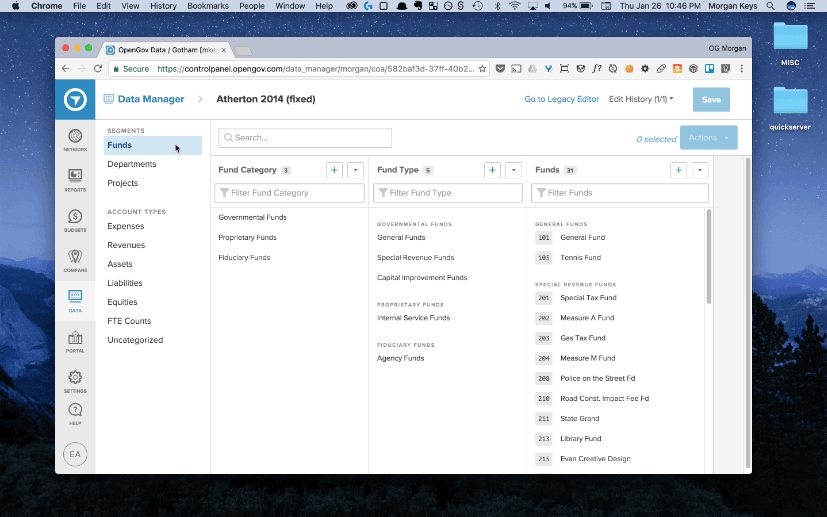
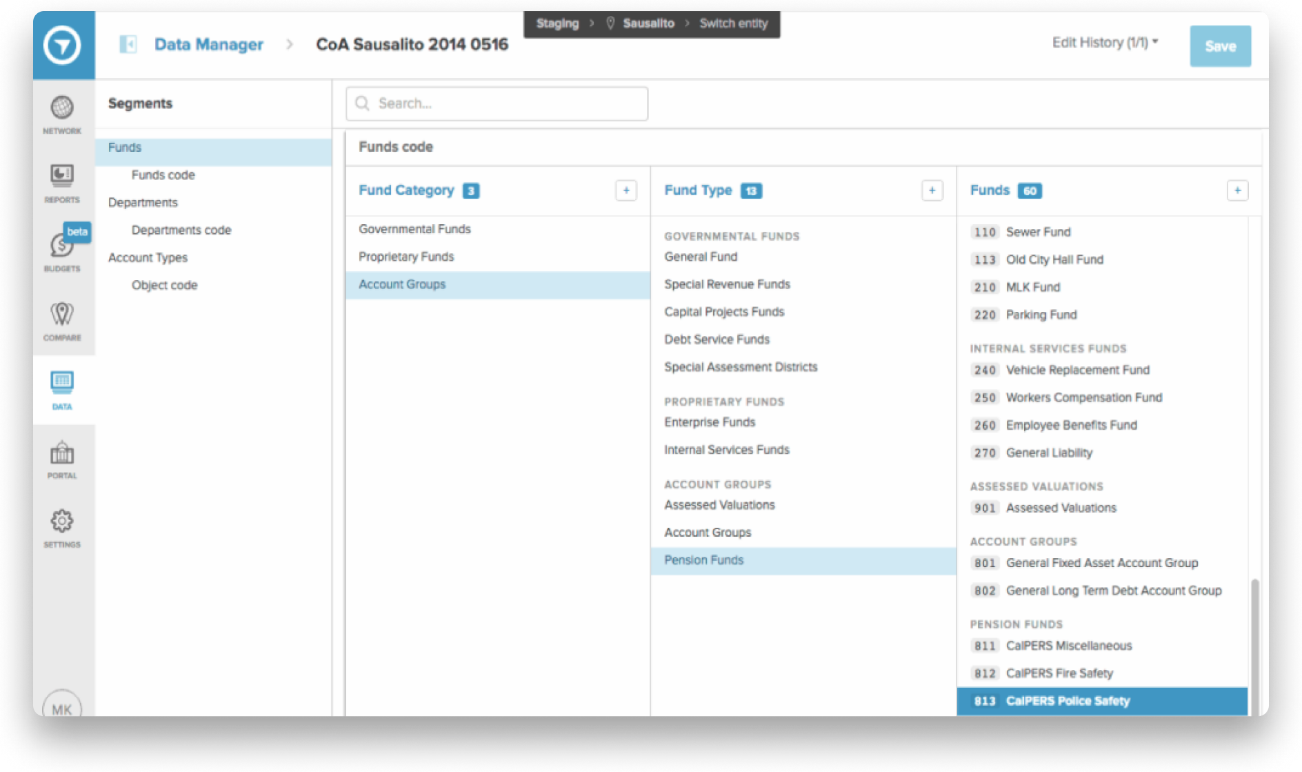
The new design replaced the old editor and became the workhorse of the OpenGov platform. It enabled Customer Success to efficiently support customers and make chart of accounts manipulation accesible to more end-users.
Many users reported moments of delight when trying the new tool. They seemed to have small epiphanies, as if to say, “oh, right, that’s how it works”. In the world of accounting software, this may be one of the only tools that is actually fun to use.
The tool also made some surprising achievements. First, even though the tool was typically packaged with the platform, one customer opted for a special contract, paying $42,000 for just the Chart of Accounts Manager. Second, the novelty of the user interface combined with some of the technical achievements in it’s engineering have won OpenGov a patent (US20170270697A1).
Morgan Keys | Summer 2019
Morgan Keys
OpenGov: Chart of Accounts Manager
Live prototype available!
I’ve recently been exploring AI prototyping tools. As a fun exercise, I’ve rebuilt the COA manager experience from memory. I’m continuing to tweak the prototype and add features from the original product. It’s currently un-styled, but you can get a sense of the interaction paradigm and what makes this product unique. (Built with Figma Make)
View AI prototype
Public servants
OpenGov’s primary users are the public servants who run local governments. This can include elected officials such as mayors, but the more common, day-to-day users are department heads, analysts, accountants, and finance directors.
The bulk of my work focused on accounting and finance users. These users are risk-averse, detail oriented people. But they also take pride in their work and view it as their solemn mission to articulate financial data in a way that their staff and the public can understand.
Financial transparency
Local governments upload large amounts of data to OpenGov on a quarterly or monthly basis and then use the platform to share interactive reports both internally and publically, with the citizens they serve.
Due to the complexity of financial data, the usefulness and accuracy of these reports is heavily dependent on the way data is categorized. Sophisticated categorization schemes are created in enterprise resource planning systems and must be mirrored in OpenGov.
The categorization scheme for an organization is referred to as a “chart of accounts”.
Taxonomies
A chart of accounts is a long-standing, esoteric accounting tool, but it is essentially a series of taxonomies. Thus, an easy analogy for the average person would be the classification of animals: just as scientists place an animal into groups, one for each level, accountants do the same for transactions.
The difference in accounting, though, is that they use multiple taxonomies for each transaction and the structure can vary from one organization to another, or even based on the kind of report.
A small government might use three taxonomies, each with 2-3 levels. But more sophisticated govenernments could have 4-5 taxonomies, with up to six-levels. We often saw charts that tracked tens of thousands of types.
The legacy solution
OpenGov already had an existing tool for managing charts of accounts, built as an MVP in the early days of the start up.
The tool made certain implementation assumptions that meant these taxonmies had to be handled separately. It also used a folder-like interface that did not actually represent the data well and, due to a lack of error-handling, even allowed users to make non-sensical edits and corrupt their data accidentally.
When I was assigned to work on a chart of accounts manager redesign, there were things we couldn’t change, but we could improve the user interface.
Listening and learning
Other than a background in math and a curiosity for data structures, I had little relevant experience to draw on for this project. My first step was to listen and learn.
Luckily, we had retired finance directors on staff with decades of experience. We also had a team of technical support staff who were talking with customers on a daily basis, training them and solving technical challenges. I set up learnings sessions and made countless desk-visits.
I also took the opportunity to join customer calls and learn from customers directly. I listened for the kinds of questions they asked customer success and then asked questions of my own.
Becoming an expert
Given the complexity of this tool and the data it was managing, I had to really grapple with the subject matter. I began diagraming concepts, at first just to help articulate ideas to myself.
I shared these diagrams with the customers success teams for feedback. It prompted great discussions, but we also realized that these documents could be training tools. After all, I was not the only team member struggling to learn these concepts.
The customer success team ultimately began distributing these documents to customers as well. Over the course of this project, and in my later work, I became one of the company’s chart of accounts experts.
Early concepts
When I felt that I was beginning to grasp the concept of a chart of accounts, I looked for ways to better represent it in the interface. Inspired by a popular data-visualization library, I tried mocking up an interface that represented taxonomies as a dendrogram.
It was an exciting approach, with the potential to give an unprecedented bird’s eye view of the chart of accounts. But there were serious problems.
First, the tree like organization made it difficult to view the entire categorization for a type—something critically important in a taxonomy. Second, illustrating the connections meant that text was not packed tightly and it would be hard to see thousands of nodes in a readable way.
Back to the drawing board
One of my favorite, under-appreciated research methods is artifact analysis. By analyzing the files and objects that people use to perform their work, you can learn valuable, tacit insights.
I examined the spreadsheet files that users were uploading to OpenGov. I tried to understand the way information was laid out. I realized that spreadsheets did a great job of displaying taxonomies in a compact, readable, and easy to manipulate way. There was only one draw-back to the spreadsheet—the row-column grid required that labels be repeated to show when many categories were grouped under a parent, leading to visual noise.
It occured to me, what if we could make something dynamic?
A new concept
Imagining a dynamic spreadsheet, with columns automatically scrolling to show relationships, I mocked up the new concept. It was a difficult concept to communicate abstractly so I tried various methods to explain them. I tried Framer, animations, and even simple html/css prototypes. The concept became known as the “slot-machine” in reference to the way it synchronized.
Eventually, I paired with an engineer who built an early alpha version for testing.
Usability testing
I travelled with OpenGov account mangers to visit local customers and test with live customers. I used a short pre-interview script and ran a standard task-based usability test. The goal was to assess if users could understand what the interface was communicating and if they could sucessfully perform basic editing and navigation tasks.
The results were very positive. Especially considering the unique approach to visualization, it was exciting to see how naturally users picked it up.
These tests provided important validation of the concept, but we later learned that there were limitations.
Working with Customer Success
OpenGov is an enterprise sales company, which means that account management and customer success play a huge and ongoing role in the customer experience. In fact many customers, due to busy schedules or a lack of tech savvy, relied entirely on customer success to handle the technical work necessary to set up their accounts. This included working with the Chart of Accounts Manager.
And though I had spent many hours speaking with and learning from Customer Success, it became clear that they were the true power-users and I would need to learn their day-to-day workflows as well.
Based on learnings from 1-on-1 work sessions, I designed several features that enhanced their ability to search and make bulk-edits. One such feature allowed users to apply multiple filters at different levels, meaning they could quickly target a set of items and then easily move them to a new parent.
These features opened the door to the tool’s ultimate success.
Impact
The new design replaced the old editor and became the workhorse of the OpenGov platform. It enabled Customer Success to efficiently support customers and make chart of accounts manipulation accesible to more end-users.
Many users reported moments of delight when trying the new tool. They seemed to have small epiphanies, as if to say, “oh, right, that’s how it works”. In the world of accounting software, this may be one of the only tools that is actually fun to use.
The tool also made some surprising achievements. First, even though the tool was typically packaged with the platform, one customer opted for a special contract, paying $42,000 for just the Chart of Accounts Manager. Second, the novelty of the user interface combined with some of the technical achievements in it’s engineering have won OpenGov a patent (US20170270697A1).
Morgan Keys | Summer 2019